CASE STUDY:
OCEANKIND
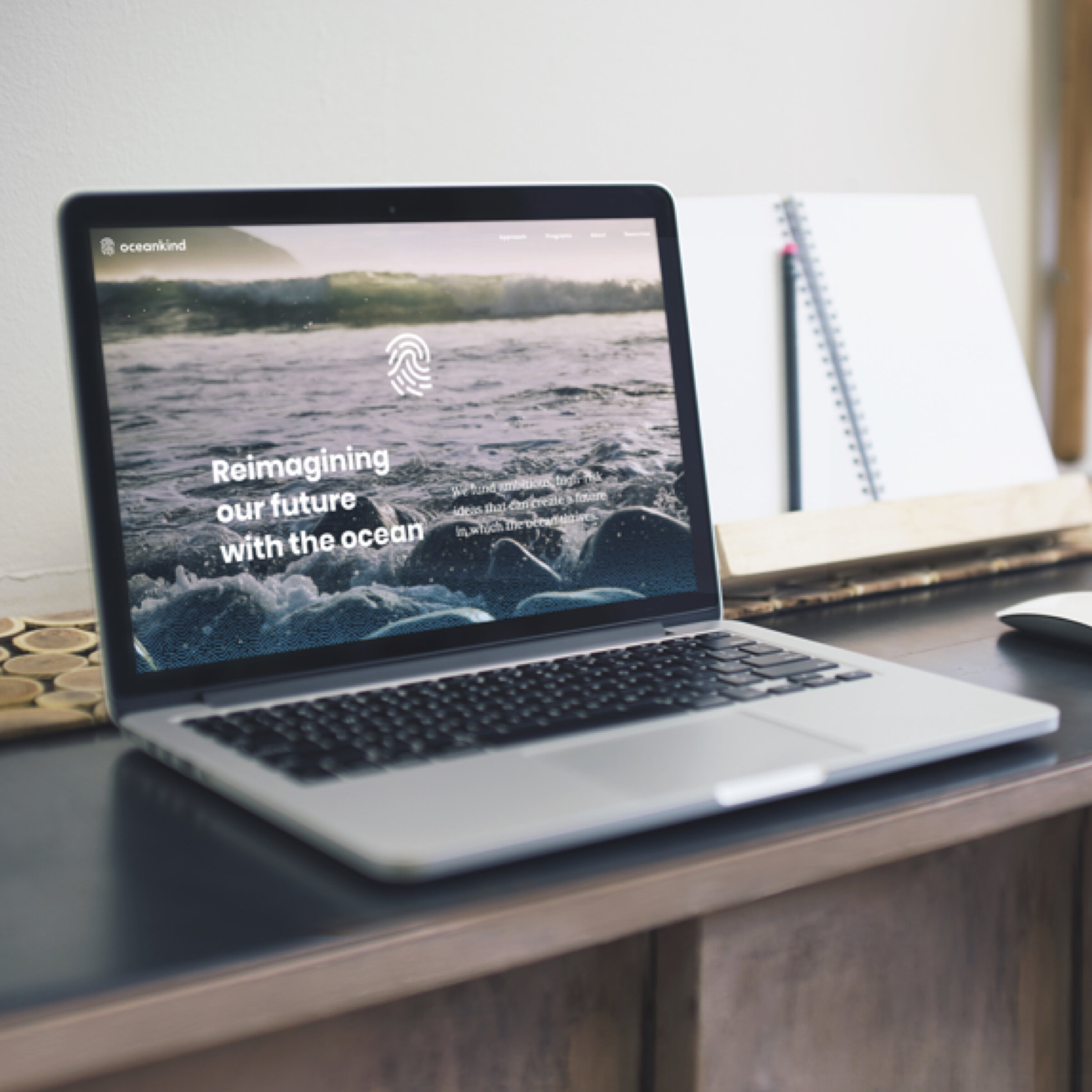
Reimagining Our Ocean's Future
RADICAL IDEAS TO SAVE OUR OCEANS
ISSUE
Oceankind, a new philanthropic model and emerging funder in the Ocean Conservation and Innovation, needed a new brand and message to reveal publicly and to communicate their vision.
SOLUTION
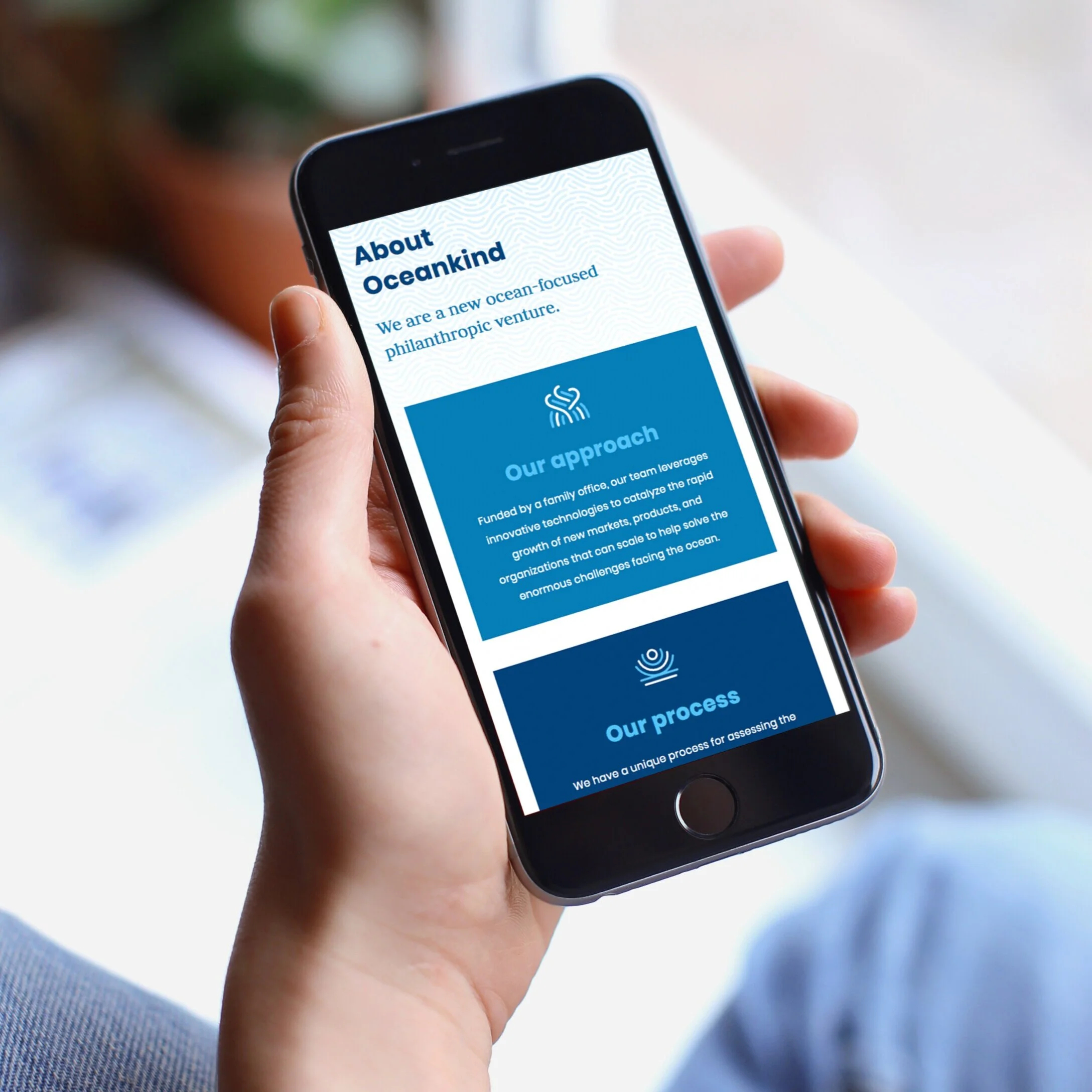
A uniquely balanced brand and that combines ideas of human connection with the ocean and technological approaches. The resulting website, logo, and brand extension pieces help to position an exiting new institution to help solve the most pressing issues affecting our Ocean.

An entirely new organization, Oceankind was still developing its identity when we started the branding work with them. As often happens, the process helped them define how to express their ethos.

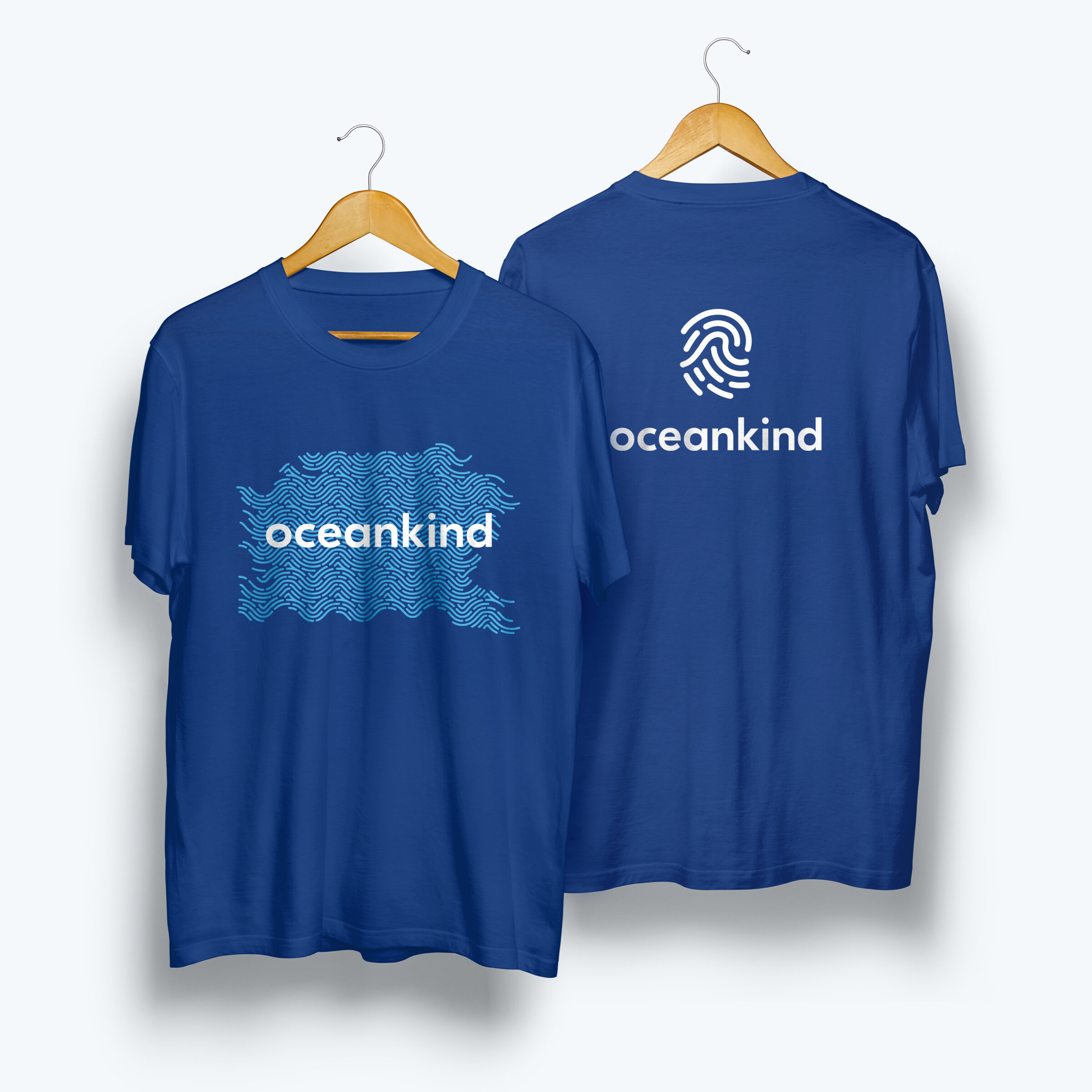
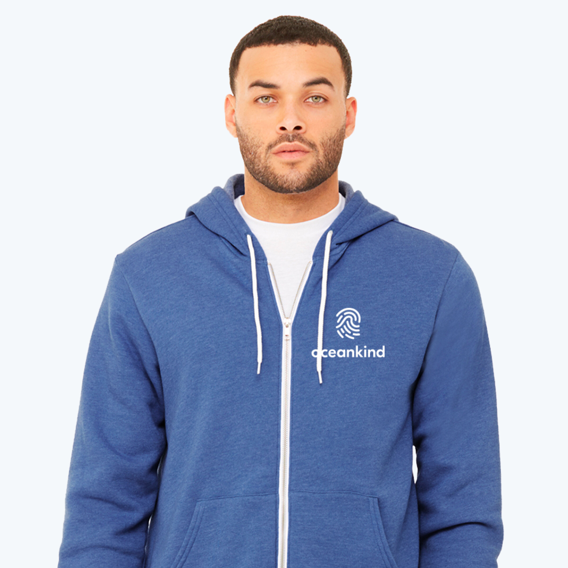
The logo needed to clearly fit in the oceans space, yet stand out as an identity as unique as the organization. We wanted to avoid having it look like a tourism or surf brand while pairing well with potential partner logos in the ocean conservancy space.

The final brand speaks to oceans with its distinct fingerprint wave shape. This combination reflects the human connection with oceans that drove the creation of the organization and inspires them to do the work they’ve taken on.
From the beginning, the Oceankind team encouraged us to explore and experiment. Initially, this gave us some wildly different logo directions. We grouped ideas into 3 different themes, and created variations of each, honing in on elements that resonated with the Oceankind crew.

The icon set that accompanies the brand follows the logo style but uses two colors. The icons depict aspects of Oceankind's approach and methodology.